// SPACE.COM — SPAZIO & SCIENZA
Modern sci-fi movie posters usually suck, but Supergirl shows that it doesn't have to be that way
What's with all the boring montages of Jedi and superheroes? It's time to resurrect a lost art.
When you purchase through links on our site, we may earn an affiliate commission. Here’s how it works.
DC's new "Supergirl" may or may not turn out to be a classic of the comic-book genre. It may or may not be a smash hit in theaters. But whatever else happens when Kara Zor-El flies into the unpredictable headwinds of the worldwide box office, one thing the new movie has got 100% right is its promo poster.
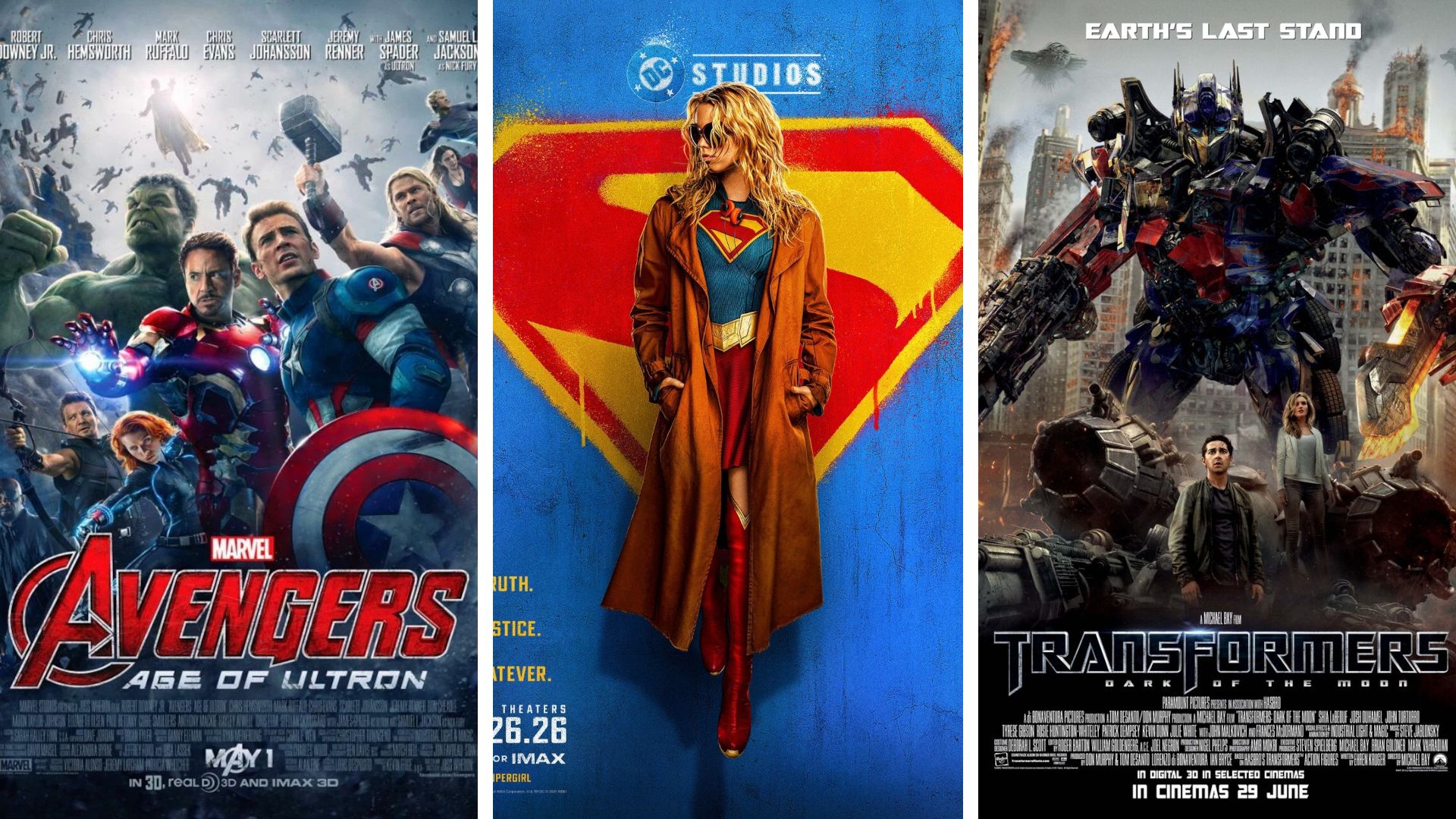
Let's take a look at its components. The bright, primary-colored House of El logo in the background is so bold and unmistakable that there's no need to spell out that this is a Super movie. At the same time, having that famous shield spray-painted on a wall is elegant shorthand for "Looking for overgrown boy scout Clark Kent? Then move along".
Meanwhile, lead actor Milly Alcock's "don't care" pose — not to mention the overcoat, sunglasses, and retro headphones — screams attitude. And by the time you get to that "Truth. Justice. Whatever" tagline… well, you know pretty much everything you need to know about our latest trip to James Gunn's new-look DC Universe. The only thing it's missing is super-pooch Krypto.
This "Supergirl" promo stands out in multiplex foyers as every good poster should, yet feels like a rarity in modern Hollywood. Time and time again, one-sheet designs revert to a tried, tested, and tedious formula of Photoshopped (other design software is available) montage of famous faces from a movie. Many of them are presented in the same muddy monochrome — it's almost as if they've stepped out of a Zack Snyder movie — and you need a microscope to make out many of the details. Catching a theater-goer's eye seems a long way down anyone's list of priorities.
It hasn't always been this way, because the science fiction genre has been responsible for many of the best film posters ever made. In the 1950s, B-movies and even the occasional studio tentpole used their promos as unashamed generators of hype, commissioning artists to paint giant arachnids, giant monsters, and — in one notable 50-foot example — giant women. Embiggening the baddies was clearly one of the first things these artists were taught at poster school.
They also refused to be constrained by minor inconveniences like plot details. Posters for both "The Day the Earth Stood Still" (1951) and "Forbidden Planet" (1956) are built around angry robots carrying scantily clad women, even though neither film features any such scenes.
A decade or so later, space-set sci-fi movies like "2001: A Space Odyssey" (1968) and "Silent Running" (1972) were opting for a rather more subdued approach. Indeed, their hardware-heavy one-sheets looked more like the covers of hard SF novels than movie posters. "2001"'s more famous conceptual "The Ultimate Trip" star child promos weren't created until Stanley Kubrick's epic was given a 1970 re-release, as movie execs tried to capitalize on its growing, though unintended, reputation as a psychedelic counter-culture classic.
But it's arguably two insanely influential movies released within two years in the late-'70s that laid down the blueprint for what a sci-fi movie poster could and should do — "Star Wars" and "Alien".