// HACKER NEWS — CYBERSECURITY
Why 'What's Opera, Doc?' looks like that
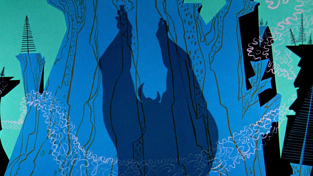
Welcome! This is another Sunday edition of the Animation Obsessive newsletter, and this is the plan:
1. Maurice Noble’s design for What’s Opera, Doc? (1957).
It’s one of the really famous cartoons. If you’re reading this newsletter, you’ve probably watched it yourself. After almost 70 years, What’s Opera, Doc? endures.
Classic status wasn’t exactly the team’s goal. This was, in some ways, a workaday Bugs Bunny production. “What’s Opera, Doc? is one many Europeans adore,” Chuck Jones said in the ‘70s. “They call that my ‘masterpiece,’ which it may or may not be; I didn’t think about it at the time.”1
He did know it was a bit ambitious. At a cost of $35,510 (almost $430,000 today), it was spendier than most Warner cartoons. It took seven weeks compared to the standard five. To get the extra work done, Jones and his crew secretly shaved a couple weeks off other, easier films and faked their time cards. It was something they did on occasion. (The mysterious price increases angered the managers, Jones said, but they were “not very bright” and didn’t figure out the trick.)2
Some unique features of this project were its complicated score, recorded ahead of time, and its movements studied from ballet stars Tatiana Riabouchinska and David Lichine. Plus, Jones drew “almost 500” pose sketches (“as well as a further 1,500 unused roughs”) to guide his animators, whereas most films got 300.3
Those things and others, including the voice performances, made the short special. But Jones liked to credit one element and one person in particular with its success. He pointed to Maurice Noble, designer of the colors and layouts.
What’s Opera, Doc? is a film of “angular settings, gargantuan shadows, rapid cuts, odd colors and dramatic camera angles,” in the words of Charles Solomon. And every shot of it required Noble’s touch. “Without Maurice Noble, who excited, moved and stimulated us all,” Jones wrote, “that film could not have been made.”4
Maurice Noble was one of the top mid-century cartoon designers. But he wasn’t a member or a fan of UPA. “I don’t believe I was influenced by UPA at all. ... I think UPA outsmarted itself in overdesigning,” he said. The UPA designers, for their part, didn’t seem to like him, either.5
Either way, Noble gave many of Jones’s films a slick, modernist look in the ‘50s. He viewed design as a form of storytelling and adjusted his style to fit each project. “Background design is all about conveying emotion and supporting personality,” Noble once said. Like he told Animato: