// 9TO5GOOGLE — MOBILE & WEB
Pixel Watch update brings a sweet redesign I wish was on more apps
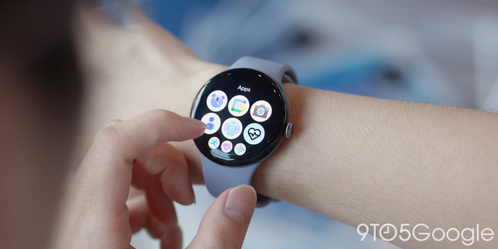
Google has been at its gradient redesign schtick for a while now to varying levels of success, but its latest redesign has just landed on the Pixel Watch for the Media Controls app, and I love it.
Quietly rolled out, the Media Controls app on Pixel Watch has picked up a redesign to its app icon, adopting the same gradient look we’ve seen across several other Pixel Watch apps.
The difference here is that Google’s styling expands beyond a simple coat of paint. The new look extends to the edge of the icon with play/pause in the center and a ring indicating playback around the border, just like the actual app itself – the app, to be clear, hasn’t been redesigned.
I’ve personally been a bit mixed on these redesigns, but this one really nails it in my book. I wish Google would do this sort of thing more often. The white borders are nice in some cases, but I very much miss the whimsy of the icons that took up the full size available to them – that mid-2010’s icon was the absolute peak in my opinion.
Pixel Watch has been quietly rolling out more of these icon redesigns in recent months, with the other most recent additions including Alarm, Stopwatch, and Timer from around August/September.
Follow Ben: Twitter/X, Threads, Bluesky, and Instagram
FTC: We use income earning auto affiliate links. More.